Illustration Update
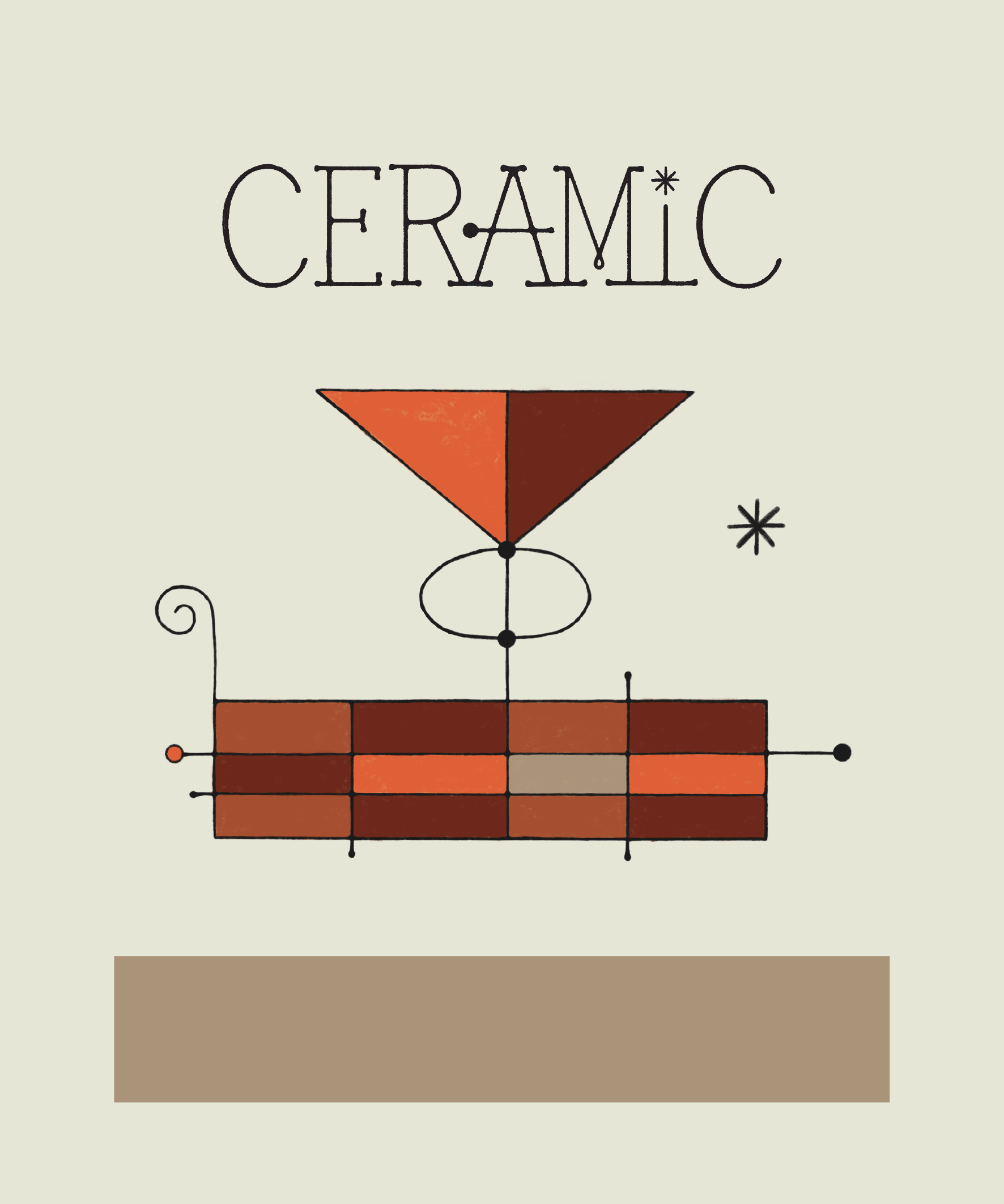
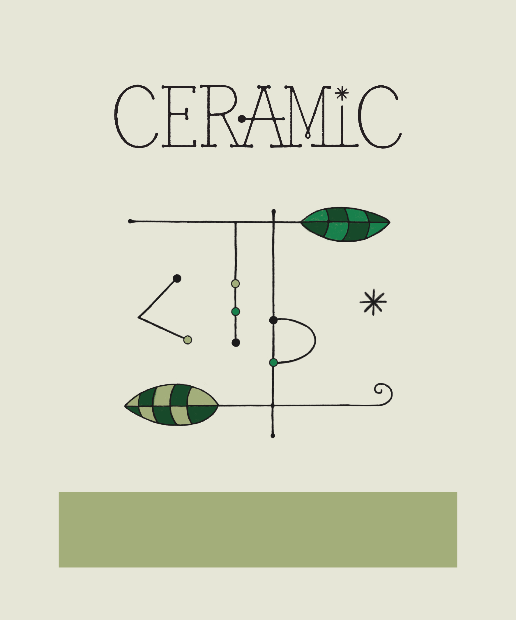
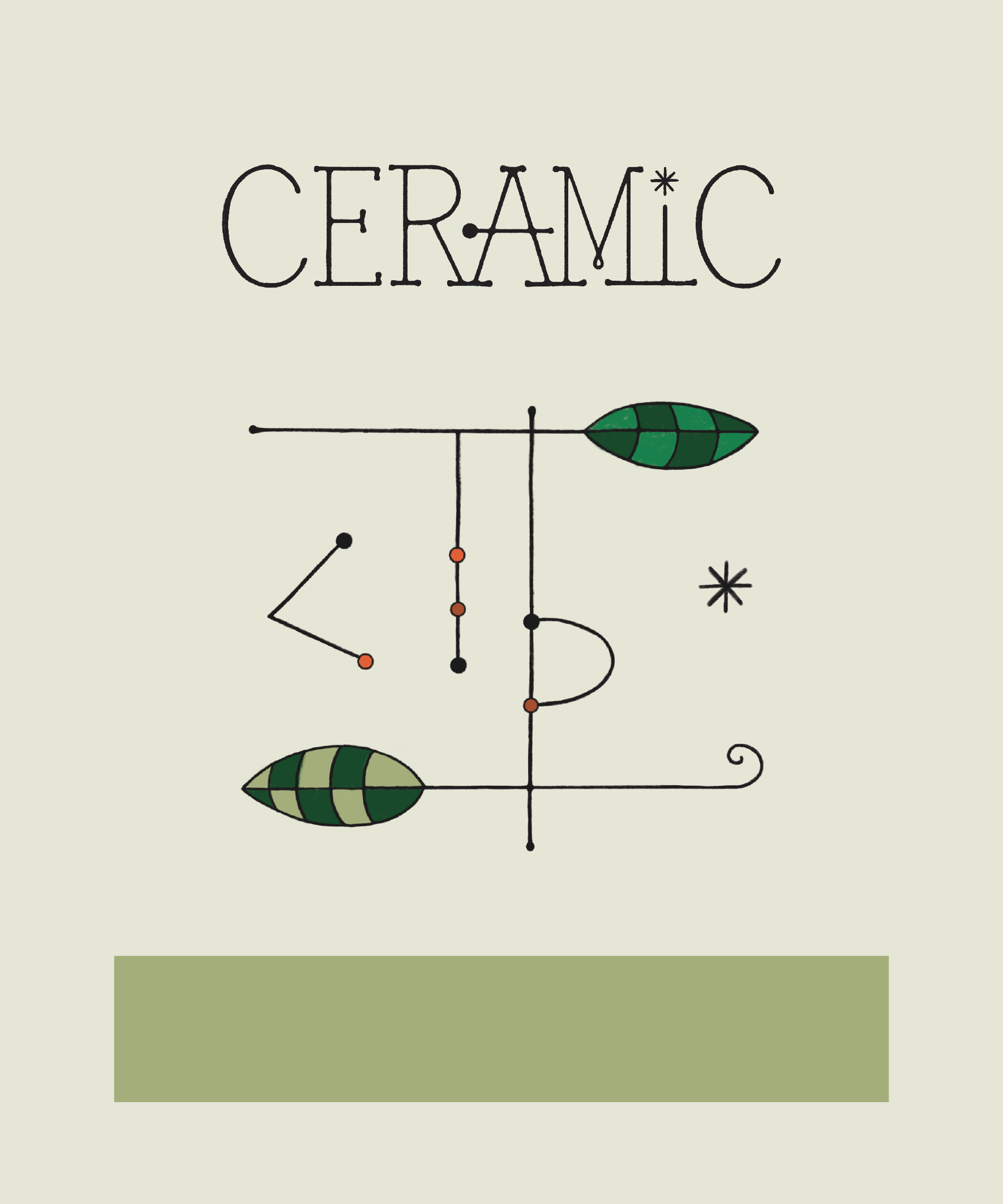
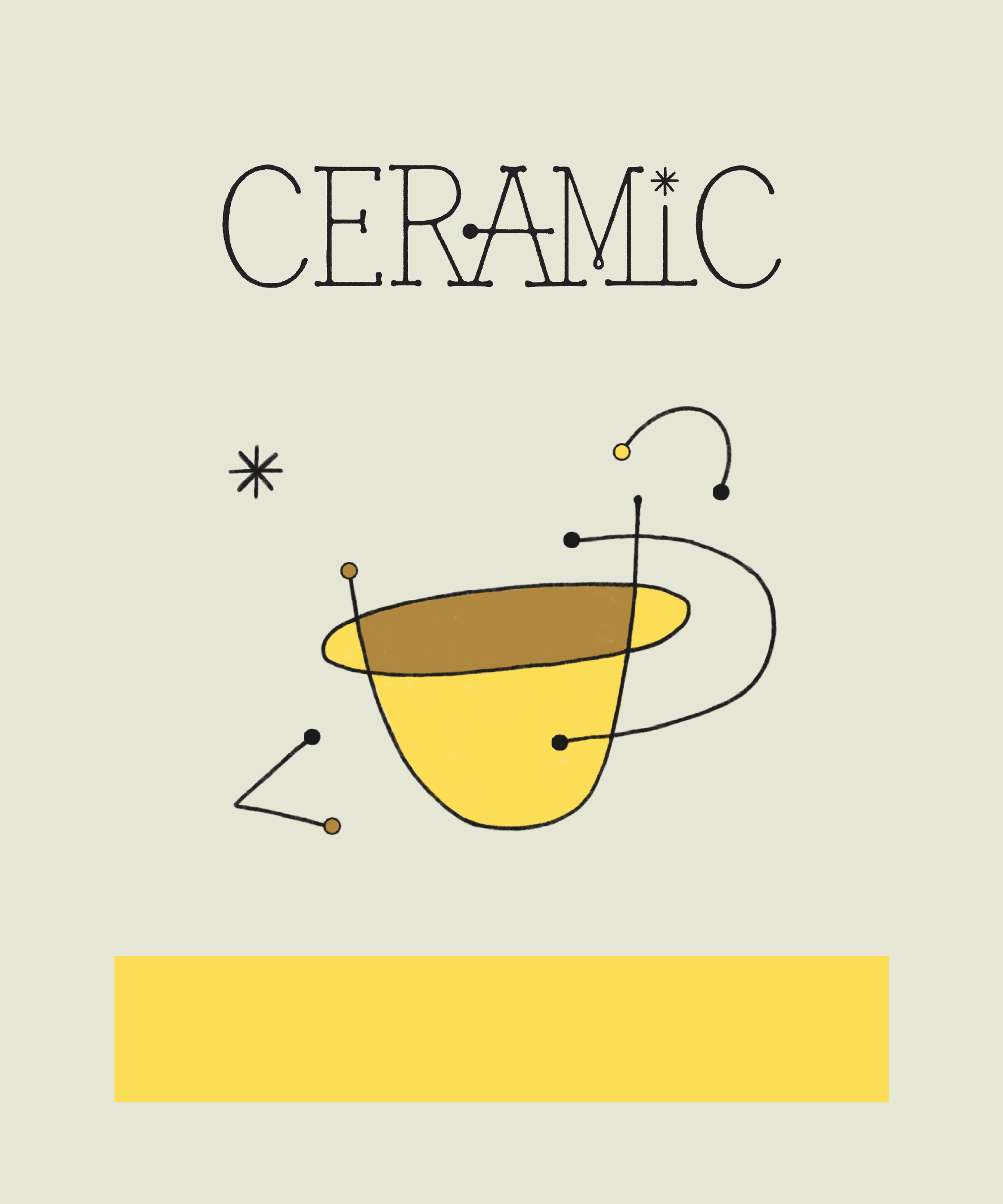
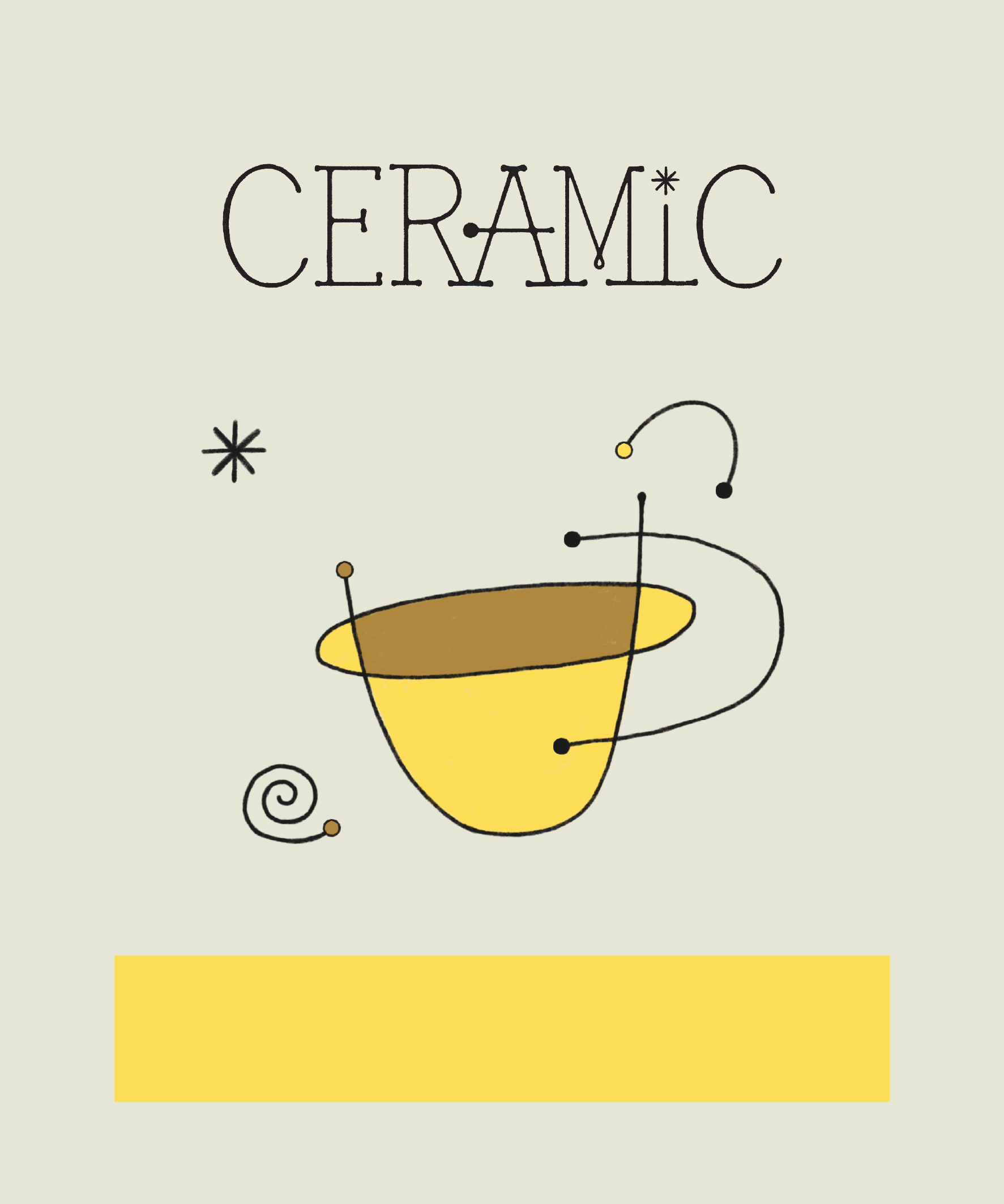
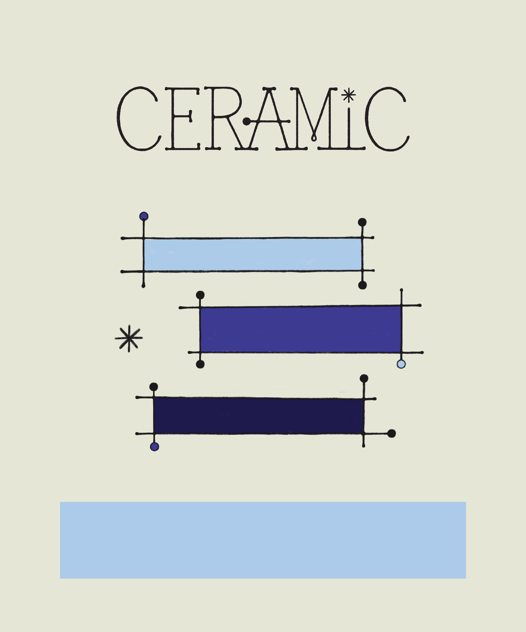
Below are new illustrations that we re-drew to better fit the surface area of the new bag. We added small details to match the serifs in the logo, updated the black dots to match the size of the dot in the logo, as well as small colored dots.
We feel that filling in the dots red on the green illustration would be inconsistent with the rest of the illustrations since the rest are monochromatic. In our opinion, the green dots work in this case, as coffee cherries are naturally green at first when they grow.
We also added a second option for the yellow illustration with a spiral, as we felt it’d be nice to include that somewhere given its connection to clay bodies.
Let us know what you think!
Feel free to leave any feedback below, or email us.